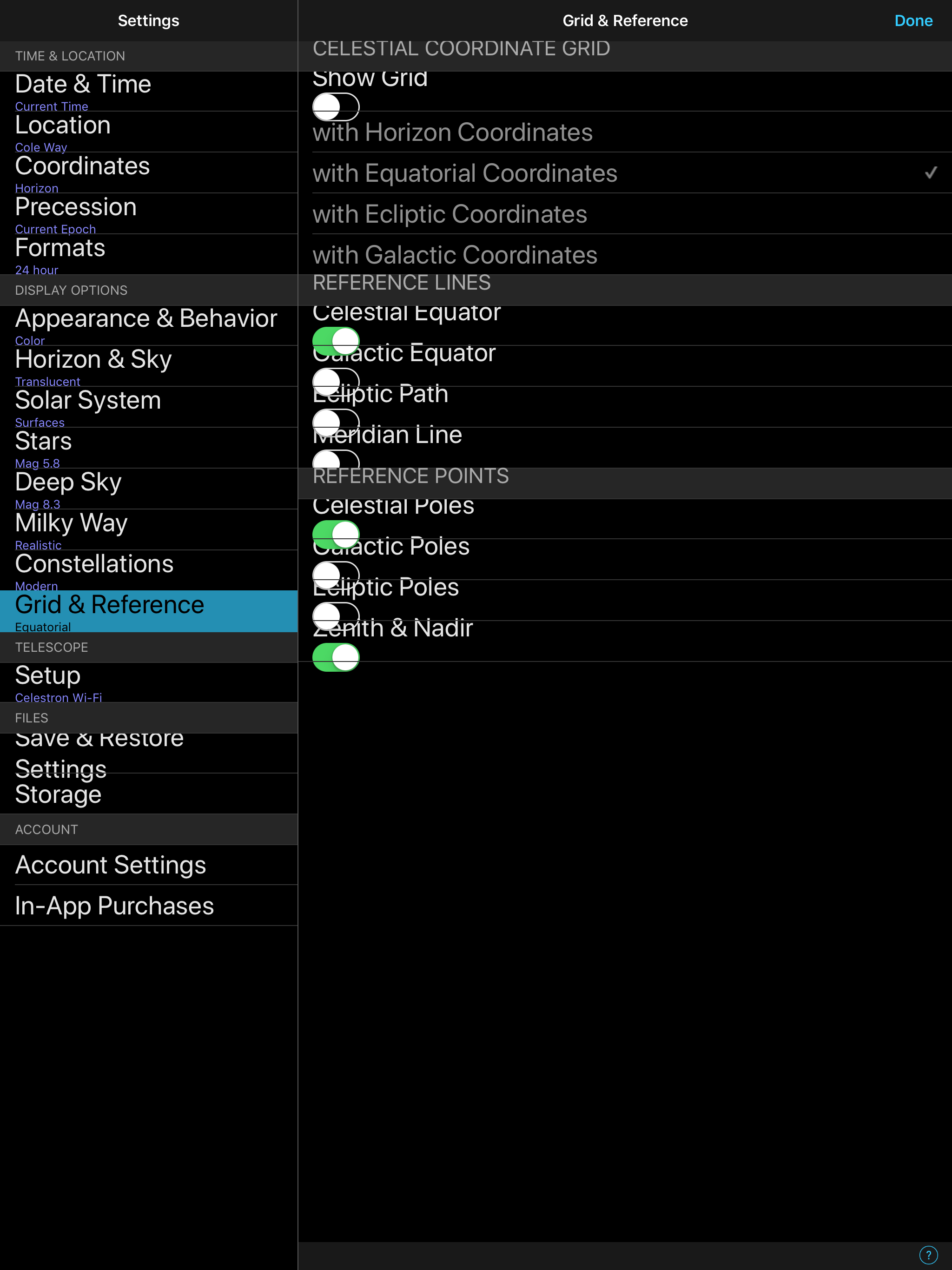
took advantage fo SS6 Pro and upgraded from 5. First observation is that Pro 5 menu text are tidy whereas Pro 6 are 'bunched-up' and interfere with the next line.
Although the options function ok, it looks very cluttered.
Attached is a screenshot from my iPad Pro 12.
Suggestions?
Thanks
Gary.