First, your app, bar none, is absolutely the best on the market! The only option that would make it better is to have your inverse monochrome chart, display the color graphics similar to the Interstallarum paper charts. From a visual planning perspective, this would be a great option, and present a wonderfully pleasing image to display on my big iPad Pro. Hope to see a display option like this in the future. Thanks
Date
Votes
5 comments
-

Bill Tschumy Peter,
Could you please attach a picture of what you would like to see? I'm not familiar with the Interstallarum paper charts.
-

Peter Arebalo 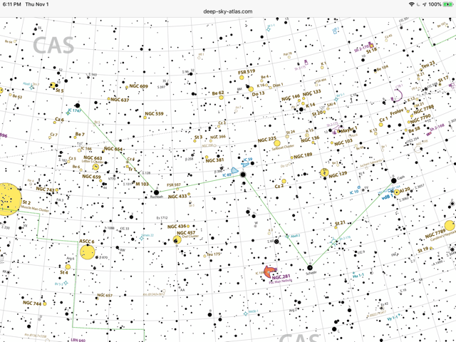
-
Peter Arebalo I’m aware of your inverse monochrome chart, but it lacks the object, color identification of some of the beautiful paper charts available in the market today.
-
Bill Tschumy OK, thanks. This would be another chart type (something like inverse-color). I will put it on the list of possible enhancements but It probably won't happen soon.
-
Peter Arebalo Cool. I knew it would not be high on your list.
Please sign in to leave a comment.